Why AI-Built Websites Look So Generic: Seven Ways to Change That
Contents
You ask an AI to build a website, and it hands back a blue-purple gradient, three cards and a wall of copy that could belong to almost any company.
Ask for “something more distinctive” and you may get the same page with a different gradient.
So how do you give it enough direction to make a site that belongs to your project?
Let's cover three things: what that “AI look” is, why it happens, and how to get away from it.
What Is the AI Look?
It's the sameness that makes a site feel machine-generated at a glance: familiar interface styling, familiar content, familiar everything. That's a visual impression, rather than proof of how the site was made.
The signs are easy to recognize:
- Stiff color choices, with enough blue-purple gradients to last a lifetime.
- Stiff layouts and equally stiff typography.
- Emoji standing in for icons everywhere.
- Hardly any real images.
- Formulaic copy.
The visitor's impression is: I'm talking to a robot.
Why It Happens: Playing It Safe
Why the fondness for blue-purple gradients, for example?
One possible explanation is familiarity. Popular CSS frameworks and the sites built with them supply recognizable patterns, including familiar color palettes. How much that explains any particular model's output hasn't been established by measuring its training data here.
The resulting association can look like this: modern website equals blue-purple gradient.
It's the design equivalent of choosing the familiar thing because it seems least likely to go wrong.
So a vague request for a “modern website” can bring you right back to those familiar defaults.
How do you get past that? Move from making a request to giving direction. State the requirements and constraints clearly enough to push the work out of its comfort zone.
Method One: Give It Real Websites to Learn From
The most direct approach is to show it a site you like and ask it to work from that design direction. Four ways to do that:
- Have the AI read the site. Use a coding tool with web access, or an MCP connection that can retrieve the page. Ask: “Visit this site, identify its palette, typography and layout, and create a site with a similar feel.”
- Provide a screenshot. If the model can interpret images, a screenshot plus a description gives it a more concrete reference.
- Convert the screenshot to code. If your coding model can't read images and a text description isn't enough, use a screenshot-to-code tool first, then pass the resulting code to the model. Code gives it something more concrete than a description of the style.
- Start with a template. A template or repository with source available for reuse gives the AI a starting point. Ask it to adapt the content while retaining the design, rather than reconstructing everything from a vague description.
Method Two: Design First, Build in Two Stages
For a larger project, don't ask the AI to go all in on the entire thing at once.
The familiar approach is: “Build a complete platform with user accounts and an admin dashboard.” Dozens of files come pouring out. Then you discover the pages look wrong, and you're paying in tokens to redo them.
Split the job instead:
- Have the AI make a static frontend demo.
- Once you're happy with the design, use that code and visual direction to build the full project.
That gives the rest of the work a settled design to follow, rather than leaving the style open at every step.
Design tools can help between those stages. Some can generate an interface prototype from a description, let you adjust the theme or annotate changes, then export code. If you already use a design tool, you can work out the site there and, where a compatible MCP connection is available, let the agent read the design and implement it.
Method Three: Add Images
A quick AI-generated site can arrive with hardly any images. Adding them gives it something more particular to say.
You don't have to generate every image from scratch. Tell the agent to find images, and where to look.
There are roughly four kinds to work with: illustrations, icons, photographs and placeholders. With a tool that can access an appropriate image library, the agent can search for material to use. That can make the page feel much more finished.
Method Four: Put Constraints in the Prompt
You can give clearer direction without any elaborate extra tools. Four approaches help:
- Negative instructions. State what you don't want as well as what you do. Specific exclusions give the agent a clearer boundary to work within.
- A role. Try: “You're an experienced independent designer focused on unconventional web aesthetics. You despise interchangeable templates.” That steers the brief away from a standard answer, without guaranteeing the result.
- No empty copy. AI can produce impressive-sounding sentences that say nothing. Spell out the standard for the writing so it has something more useful to aim for.
- Context for the mood. A generic brief gives little sense of the feeling you want. Supply that feeling before asking for the design.
That last one sounds vague, but think of directing an actor. Rather than only saying “look happier,” you might ask them to recall a happy memory so the emotion has somewhere to come from.
You can save these constraints in a project instruction file such as AGENTS.md at the project root. Tools that support it can load the applicable instructions in later chats; support and adherence depend on the tool and its instruction system. For the same request, “Make an anime video site,” those saved design rules give the agent more to work with.
Method Five: Use Existing Skills
If writing the instructions feels like work, Agent Skills offer a reusable package of someone else's approach, with the host and any dependencies providing the means to use it.
Two examples for giving a site a more distinctive design:
- frontend-design: Anthropic's frontend-design skill. With it installed in a supported client, a request such as “Build my portfolio site” can invoke its design instructions. Activation may be automatic or explicit; it doesn't have to ask a particular confirmation question, and installing it doesn't guarantee a gradient-free result.
- UI UX Pro Max: A design-focused skill that can look up relevant palette, typography, layout and style guidance, assemble a direction, then use it to guide the code. Look up what the task needs. That's the useful part of loading resources on demand.
Method Six: Change the Default Component Library
Familiar component libraries make an easy starting point. They're professional tools, but repeating the most familiar choices can also contribute to that generic look.
Ask for a more distinctive library instead. Some focus on visual effects such as particles, aurora backgrounds or shooting stars. Reusing those components can be more practical than writing every effect from scratch; it isn't that AI is categorically unable to write one.
The model may know less about a niche library. A documentation tool, or the library's official documentation supplied directly, gives it something current to work from before coding.
Method Seven: Choose the Colors Yourself
If you want a more individual direction, choose the palette yourself.
For someone comfortable with design, a palette tool can help produce the scheme. Give the agent the color values and make following them part of the brief.
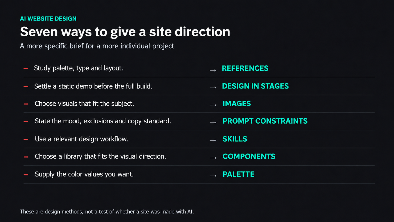
The seven methods give the agent a more specific design brief.
View full-size illustration
Combine the Seven Methods
Here are three hypothetical design briefs showing how the methods can work together:
- A technology blog: a bare request can yield a generic page. Project rules, UI UX Pro Max, mood context and a distinctive component library give it a more specific, geekier direction and a fuller brief for the content.
- A SaaS landing page: a bare request can land on blue-purple again. Combining the methods can move the background toward a code-inspired visual style and a more considered product presentation.
- A fitness-app landing page: an unhelpfully vague request can produce an unconvincing page; a more specific combination can move it toward something grounded and usable.
One Last Thing
AI can do a lot of the work of building a website. A disappointing result can sometimes come from how little direction it was given.
Think of a cook. “Make something tasty” leaves nearly every choice open. “Make it smoky, keep the heat mild and use a crisp topping” gives the cook a direction. A website brief benefits from the same kind of specificity.
Remember: AI is the tool. You're giving the direction.